Website Design
We’re website designers based in Shrewsbury, Shropshire who develop bespoke websites that will elevate your business and engage successfully with your target audience. We have an experienced team ready to meet your website design and web development needs.
Why choose us?
As website designers in Shrewsbury, we build unique and innovative websites, focusing on simple website design, using WordPress or e-commerce (such as WooCommerce or Shopify). Our bespoke website design and website development services ensure that we can successfully help you to achieve your business goals.
What we cover
Case Studies
Discover some of our work below to see how we’ve helped brands build websites that they can be proud of – and we loved creating.
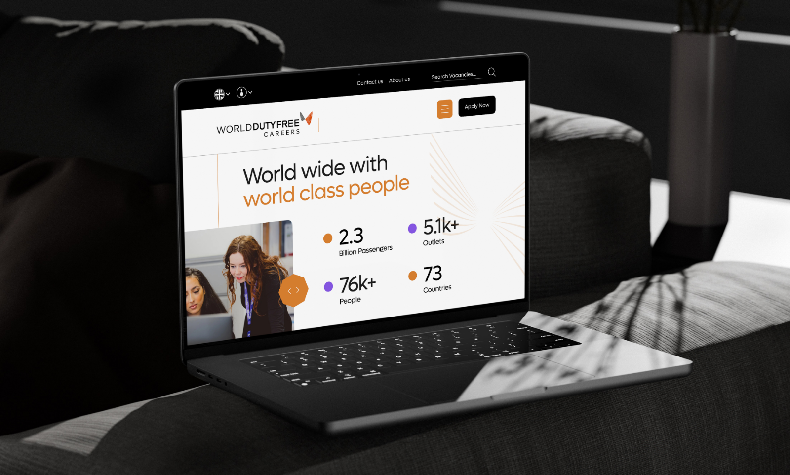
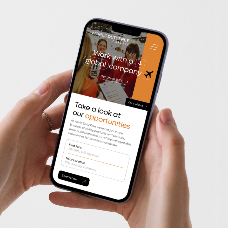
World Duty Free Careers
Positive Planet
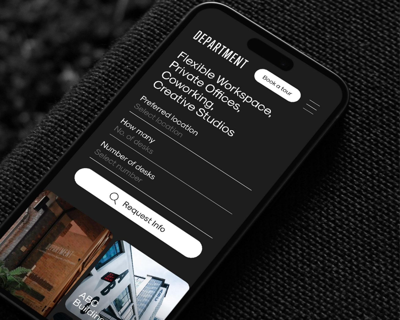
Department
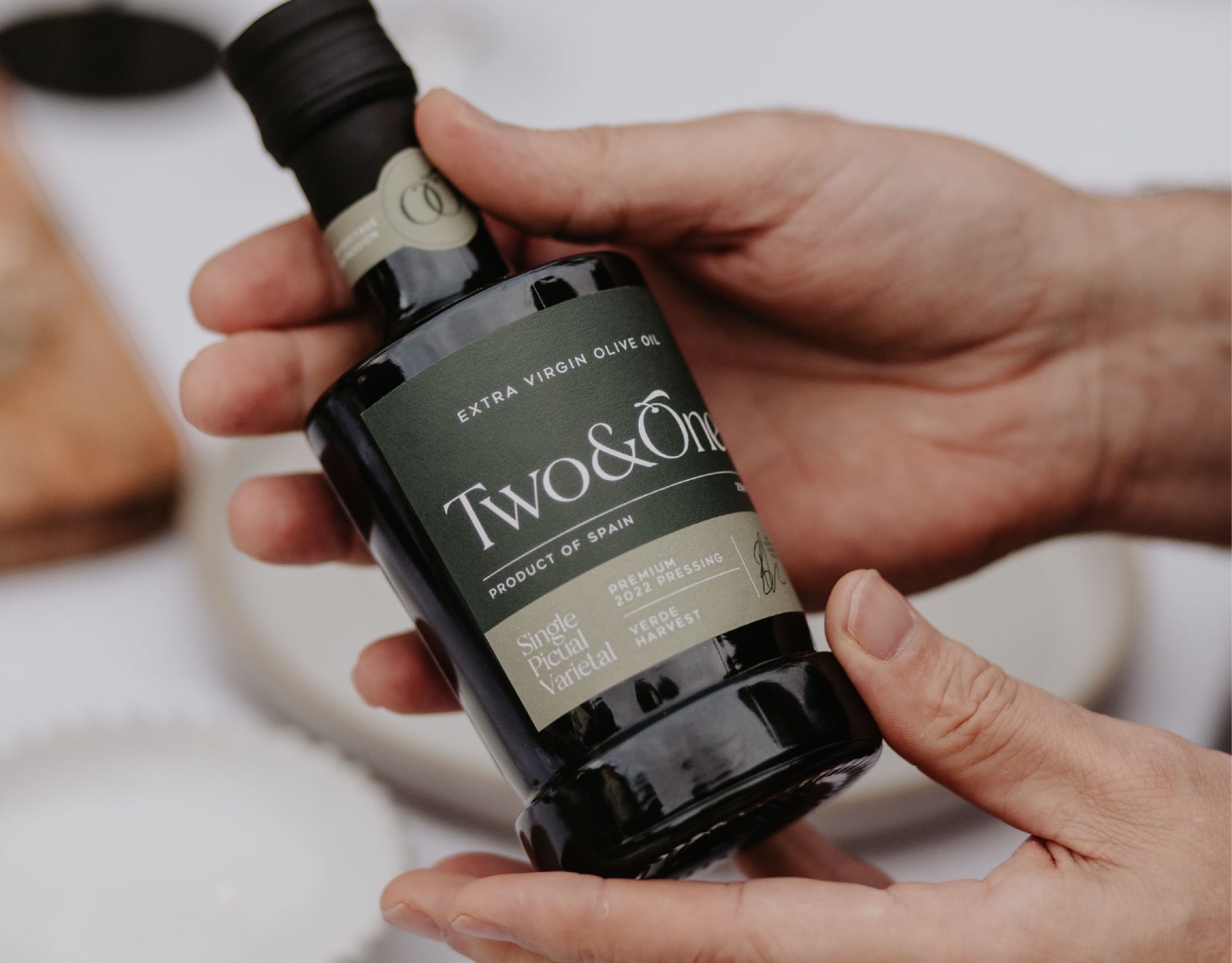
Two&One
Our Process
Our design and development teams work side by side to ensure that your website features expert navigation, SEO-friendly design, responsiveness across all devices, and is built on the very best platform for your business. By following every step of our streamlined process, we guarantee that your website will be delivered to the highest design and development standards, setting you up for success.
In addition, we offer a variety of hosting services and technical website support packages. With our proactive website audit maintenance and management, website downtime is minimised and performance, reliability and security are maximised.
01
We listen
You are the source of information that fuels our ideas and ignites our creativity. We take time to understand, appreciate and listen to what you tell us. Our collaborative approach starts here and is fundamental to building long lasting relationships.
02
We understand
We delve into your business, discovering what makes you tick and how you operate. We undertake research into your target audience, sector and competitors to gain valuable insight to inform the strategy.
03
We create
Our ethos is to deliver creativity that connects with your customers and stands out from your competitors, with campaigns that excite and exceed expectations. All whilst dovetailing with your vision and values.
04
We deliver
Whether it be brand, packaging, website or a digital marketing campaign, we are focused on the positive impact and commercial contribution our work creates to each and every client. Results speak for themselves.